Fostering Learning through Illustrations at SplashLearn
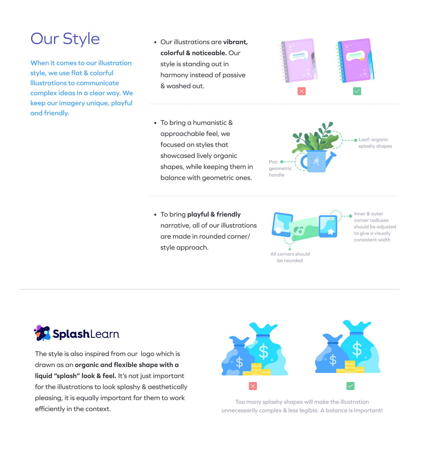
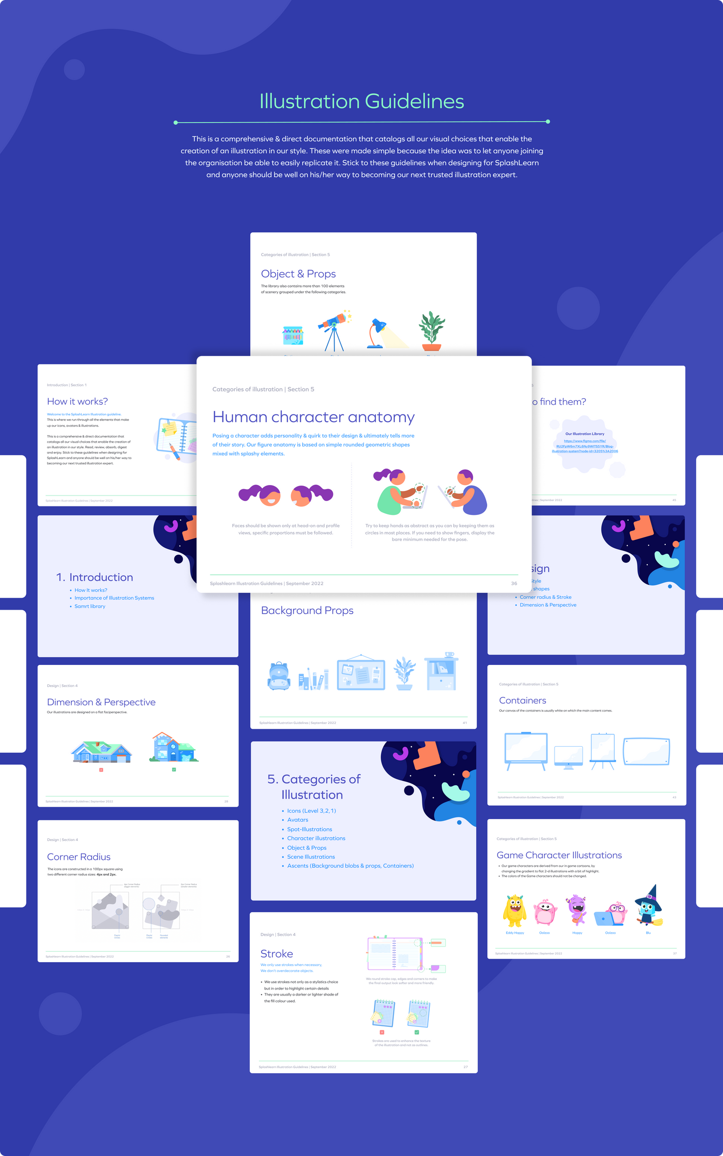
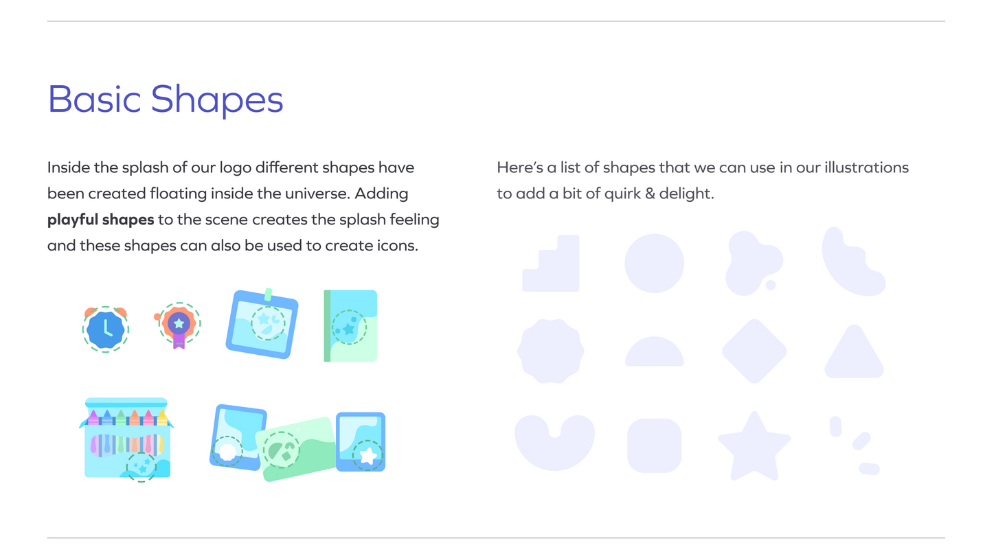
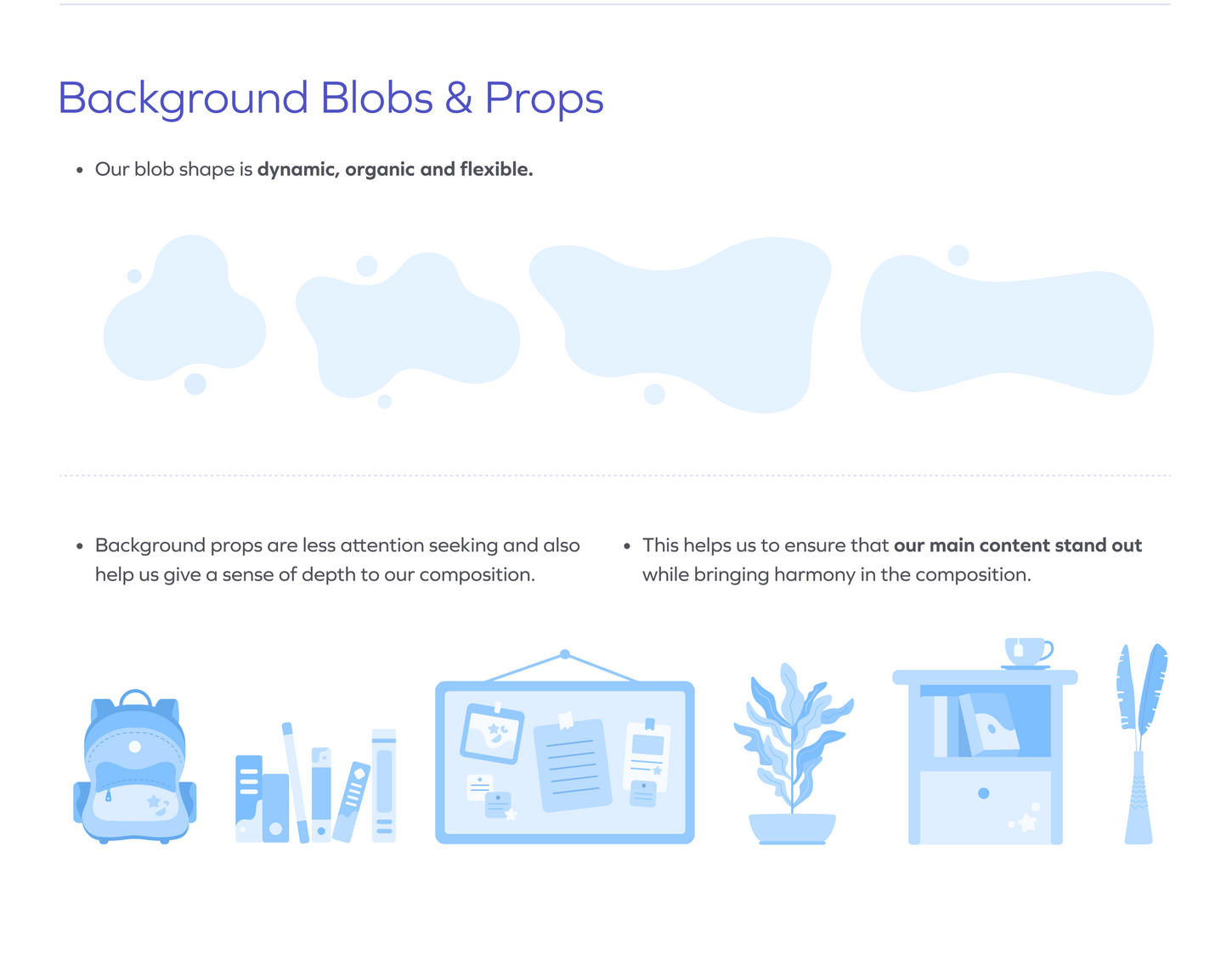
I had the privilege to build an illustration system for SplashLearn's marketing team from scratch. This included defining the visual style and tone of the illustrations, as well as establishing rules for their usage across various marketing channels. Overall, the project was a success, with the illustration system helping to elevate SplashLearn's marketing efforts and establish a unique brand identity, receiving positive feedback from teachers, parents, and students alike.
MY ROLE
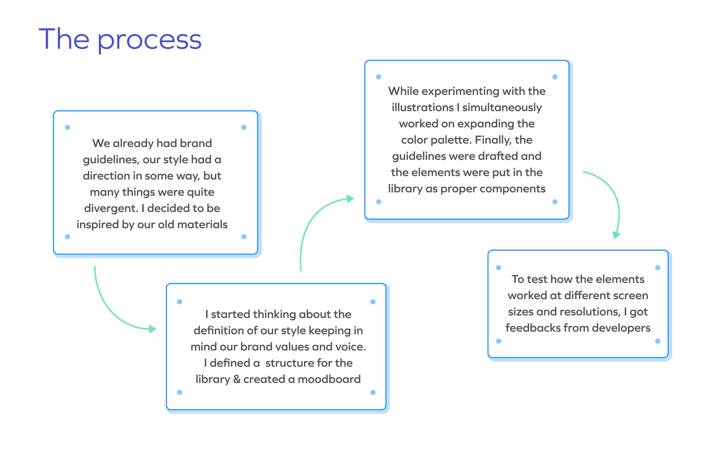
End-to-end development of Splashlearn Illustration system & guidelines. To achieve this, I worked closely with the marketing team to understand their needs and goals, as well as with SplashLearn's brand team to ensure the illustrations were aligned with the overall brand vision.
TEAM
1 Visual designer (Myself), 1 Copywriter, 1 Project manager, 5+ engineers
TIMELINE
4 months
Illustrating Inclusivity
Our characters were designed with flexibility, allowing for a wide range of gender, age, hairstyles, and race. The result was a playful and inclusive library of illustrations that reflected SplashLearn's commitment to diversity and equity.


Choosing the Right Colors
Our Illustration colour palette is a bit distinct but complimentary of our brand palette. I described the colors the HCB way because it’s more intuitive for us to think of colors as organized by three attributes:
Hue: What color is it? Chroma: How colorful is it? Brightness: How bright is it?
